A Pennsylvania museum has solved the mystery of a Renaissance portrait in an investigation that spans hundreds of years, layers of paint and the murdered daughter of an Italian duke.
Among the works featured in the Carnegie Museum’s exhibit Faked, Forgotten, Found is a portrait of Isabella de’Medici, the spirited favorite daughter of Cosimo de’Medici, the first Grand Duke of Florence, whose face hadn’t seen the light of day in almost 200 years.
Isabella Medici’s strong nose, steely stare and high forehead plucked of hair, as was the fashion in 1570, was hidden beneath layers of paint applied by a Victorian artist to render the work more saleable to a 19th century buyer.
The result was a pretty, bland face with rosy cheeks and gently smiling lips that Louise Lippincott, curator of fine arts at the museum, thought was a possible fake.
Before deciding to deaccession the work, Lippincott brought the painting, which was purportedly of Eleanor of Toledo, a famed beauty and the mother of Isabella de’Medici, to the Pittsburgh museum’s conservator Ellen Baxter to confirm her suspicions.
Baxter was immediately intrigued. The woman’s clothing was spot-on, with its high lace collar and richly patterned bodice, but her face was all wrong, ‘like a Victorian cookie tin box lid,’ Baxter told Carnegie Magazine.
After finding the stamp of Francis Needham on the back of the work, Baxter did some research and found that Needham worked in National Portrait Gallery in London in the mid-1800s transferring paintings from wood panels to canvas mounts.
Paintings on canvas usually have large cracks, but the ones on the Eleanor of Toledo portrait were much smaller than would be expected.
Baxter devised a theory that the work had been transferred from a wood panel onto canvas and then repainted so that the woman’s face was more pleasing to the Victorian art-buyer, some 300 years after it had been painted.
Christ men have been Photoshopping women to make us more “pleasing” since for-fucking-ever.
Also, Isabella de’Medici is nice looking, but also has that look in her eye of all Medicis: “I haven’t yet decided whether I’m going to kick your ass, buy you and everything you own, or have sex with you. Perhaps all three.”
The thing about how women in comics used to be drawn and sometimes are still drawn, you can only really understand the difference between an action girl being forced into unrealistic sexual, sensual positions, and an actual strong and well posed, empowering but still sexy female character, when you see what it looks like to have male characters depicted in overtly sensual poses
And I’m not talking about the Hawkeye Initiative or any given parody
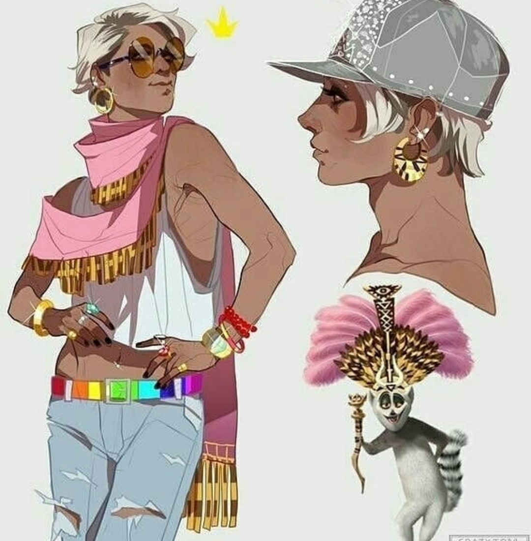
I actually want to draw a comparison using art by Kevin Wada
Kevin Wada is a proud part of the LGBTQ+ community and he has this unique ability to sexualize mainstream male heroes without it looking like a parody. He draws covers for multiple big comic companies and his style reminiscent of old fashion magazines, drawn largely in traditional watercolor, has made him a stalwart of the industry.
He also draws a lot of naked Bucky Barnes.
Anyway, I want to talk about how interesting his art is, the difference between his power poses and his sexy poses for male and female characters.
A typical power pose for a male comics character would look like this
Whereas every so often with female heroes you get something like this
Not all the time, of course, but it happens and it happens in the wrong places. You wouldn’t be posing like a cover model in the middle of a battle, you really wouldn’t.
But when it comes to Wada and male and female characters, the difference is pretty clear.
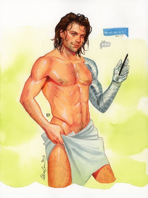
When he draws male characters, they more often look like this
Sensual, in a pose you wouldn’t usually see a big, muscular hero doing. If not that, then playful, sexy, for looking at, but nothing about their anatomy overly exaggerated
How he draws women is also very clearly different from many other artists, from sexy pose to power pose.
Still posing for the camera, still to be looked at, but very, very different from how we’ve seen female characters portrayed in mainstream comics in the past.
And I guess it’s really just a matter of variety? Objectification in art is a long time debate and appears everywhere always, but for all that we can argue about its impact on popular media, there are a few things I know for sure:
1) having a female character pose like a playboy cover girl in the middle of a battle scene is just Bad Art and y’all need to find better references
2) female power poses will never look quite as right as when they’re drawn by people who know the value of expressing personality through pose (it’s basic animation principles and some artists still need to learn it) and who actually know what a female character’s personality beyond “sexy”
3) Iron Man or Batman posing like they’re about to beat somebody up is 100% not the same as a fashion drawing by Kevin Wada where a Typical Beefy Action Guy gets to pose like a flirty pretty boy
4) the MCU films have figured out the value of pandering to female audiences by sexually objectifying all their male action heroes while simultaneously appealing to the male demographic’s action movie power fantasy. Quoting Chris Hemsworth and Taika Waititi: “I’m not a piece of meat” “Uh, yes you are.”
They definitely struck some kind of balance there.
Also, more important than this entire post: y’all should follow @kevinwada on Tumblr and give him love because his art is divine and his talent beyond words
These stunning photographs were commissioned by the Chamber Orchestra of the Berliner Philharmoniker, Andreas Mierswa and Markus Kluska let’s us see inside musical instruments, cleverly lit, narrow places become cavernous space, almost like concert halls.
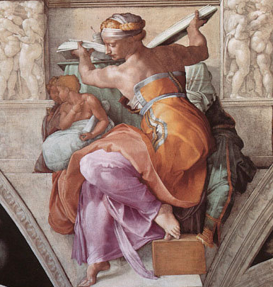
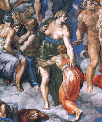
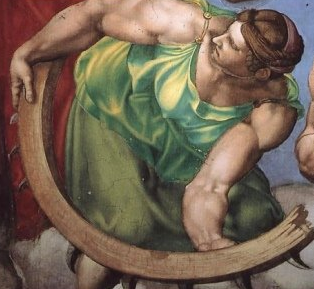
and let’s take a moment to appreciate the fact that michelangelo had probably never seen a girl naked and when he want to sculpt or paint them his mentality seems to be “wow, everyone likes women….they must be like…..buff dudes. i love buff dudes. women are buff dudes but with little chest lumps and no wiener”
“nailed it.”
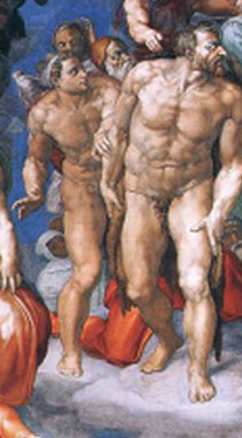
And my personal favorite, Adam and Eve
he literally painted adam and steve
I am in the absolute SHITTIEST mood right now, but this actually made me laugh out loud.